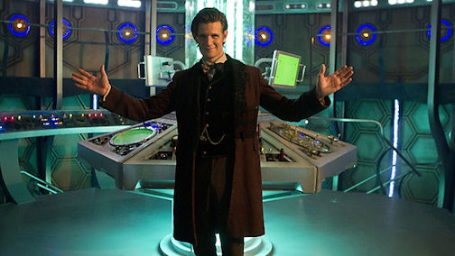
Regenerated TARDIS interior unveiled – first look!

The regenerated TARDIS interior has been revealed today in a new image taken from this year’s Christmas Special!
The latest redesign of the Doctor’s iconic police box will first be seen in The Snowmen next week. The spaceship’s new look is reminiscent of the Classic Series, with its sleek new console room and simple yet magnificent time rotor.
The makeover is part of the new changes that are coming to the show ahead of its 50th anniversary next year.
A revamped title sequence and updated theme will also debut in the festive story.

The new TARDIS – above – has been designed by Michael Pickwoad. What do you think?
Thanks to JC for the news!

I feel it’s cold, sterile and far too “generic spaceship” in it’s design. It lacks all the imagination and “whimsy”‘we’ve come to expect of the TARDIS interior. It doesn’t seem to fit with Smith’s Eleventh Doctor one bit, despite the mooted reserved nature of the Pond-less Time Lord. I expected far more from Mr Pickwoad, I really did…
It’s better looking than the last 2 console rooms. I like it, even if is slight Next Gen!!
More of a nod to the old style TARDIS control rooms. Let’s see how it plays on screen. Definitely looks more like a machine now, than a jumble sale.
From this screenshot, I don’t like it. It feels 80s cheesy sci-fi show mixed with video game mixed with Red Dwarf, almost like it’s meant to be a parody of Doctor Who.
Nonetheless, I’ll give it a chance on screen.
I like it so far; it reminds me a lot of the old console rooms. ;-) But the real test will be seeing it in action. In the end, of course, it’s the actors who will sell it.
Looking very much like the classic interior.
Although we can obviously only see a small section of it, the room just looks too small! Ten’s TARDIS and Elevens last one was big and magic whereas this one is just really cold and feels like a studio room. Hopefully it will look better on screen.